
Onboarding Case Study: Bumble's Sign-Up Flow
Bumble is one of the best-known apps for dating and making friends. Unlike many products, it has a real reason to ask for a lot up front: your profile is what other people see, and it supports safety and matching. That makes it a useful test of one of the hardest onboarding questions: how do you ask for a lot without losing people along the way?
We had a personal reason to look. When one of us tried Bumble in Biarritz, the long sign-up came first, and only after finishing it, and paying for a subscription, did it become clear how few people were using the app nearby. We've also heard from people who gave up during sign-up because it asked so much before showing anyone.
The walkthrough
From "Create an account" to the first profile, a new user goes through 16 steps across about 39 screens. Five steps can be skipped, but each one only shows that once you reach it. Nothing about the people on the app appears until the very end.
Step | What happens | Best practice it relates to |
|---|---|---|
1 | Phone number, with a note that it's used to make sure everyone is real | Ask only for what's needed now |
2 | Verification code sent by text | Ask only for what's needed now |
3 | Location permission, with a reason given and no way to skip | Show value before asking for effort |
4 | Notifications permission, which can be postponed | Show value before asking for effort |
5 | Ad tracking, introduced with the headline "Let's make this about you" | Show value before asking for effort |
6 | First name and birthday; a progress bar appears for the first time | Show progress |
7 | Gender, with optional extra detail and a note that it can be changed later | Let people skip and come back |
8 | Whether to show gender on the profile, off by default | Ask only for what's needed now |
9 | Email, skippable, for account recovery | Let people skip and come back |
10 | Mode: Date or BFF, explaining you'll only be shown to people in the same mode | Lead to one clear first action |
11 | Photos: "Add at least 4", then crop, upload and photo tips; the progress bar shows 100% | Show progress; Teach in context |
12 | Introduction to BFF mode | Teach in context |
13 | "Your life": pick up to 3, skippable; the progress bar drops back to about a third | Show progress |
14 | Interests: pick 5, skippable | Let people skip and come back |
15 | Relationship status, skippable | Let people skip and come back |
16 | Community guidelines, "I accept" | Ask only for what's needed now |
After step 16, the first profile appears, with a short swipe tutorial on the card.

What works well
Every ask comes with a reason
The phone number, location, email and mode screens each say why they're needed, in a sentence. That builds trust, especially for a product where safety matters.
Let people skip and come back
Notifications, email, "Your life", interests and relationship status can all be skipped, and gender can be updated later. After sign-up, a "Start building your profile" screen collects the rest one category at a time.
Teach in context
Selfie verification is offered after sign-up, in the swipe deck, rather than forced during it. The swipe gesture is taught on the first card, right where it's needed.
Information people give comes back as value
The interests chosen during sign-up reappear on other people's cards as "We have things in common". It's a small payoff that shows why the questions were worth answering.
What could improve
Show value before asking for effort
Three permission requests come before any profile question, and nothing about who's on the app appears until step 16. In a smaller market, people find out whether anyone is nearby only after all the effort, which is exactly when it hurts most.
Show progress
The progress bar appears only at step 6, reaches 100% at the photo step, then drops back to about a third and fills again. People are told they're done, then told they're not. A progress bar is a promise, and this one breaks it.
Ask only for what's needed now
The photo screen asks for "at least 4 photos", but the next button appears active with two, and the profile screen later shows "Photos 2 of 4". If four is a recommendation, the copy makes the effort sound bigger than it is.
Teach in context
The photo tips appear after photos have already been chosen, when they would help most just before.
Clear wording
The ad tracking screen's headline, "Let's make this about you", frames tracking as personalization. The body text does say it's for ads, but the headline should too.
Our recommendations
1. Show who's nearby first
Right after location, show a preview of people nearby in the chosen mode, such as a count or a few blurred cards, before asking for photos and profile details. People see the value, and in smaller markets they can decide early whether the app is worth the effort.
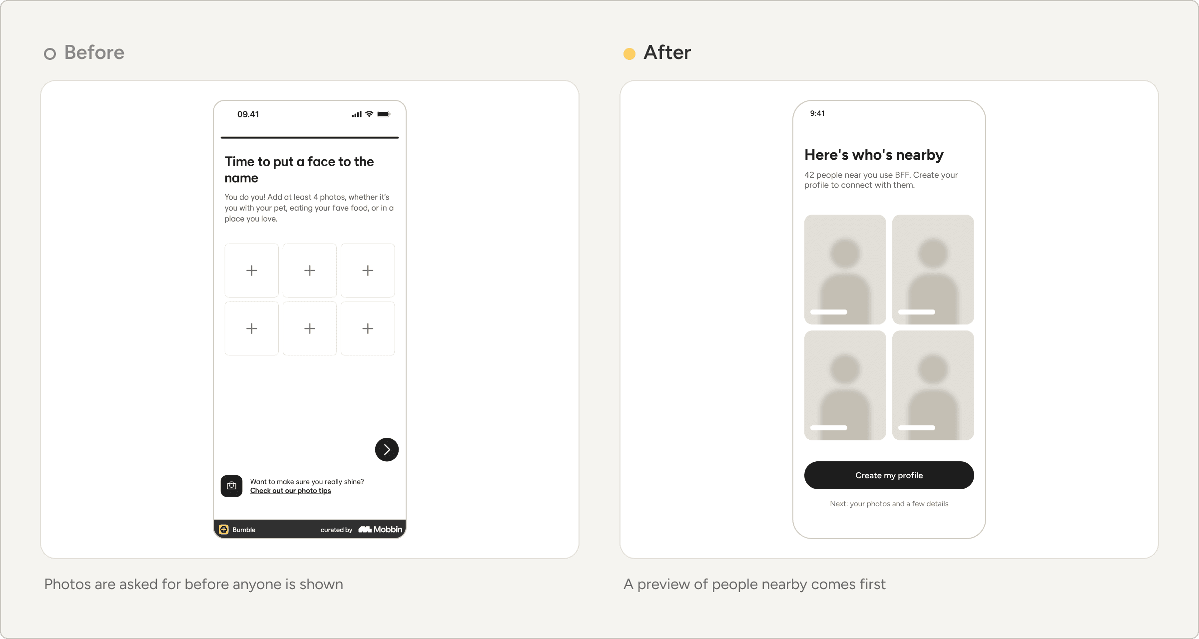
2. Ask for permissions when they're useful
Ask for notifications after the first match or message, and introduce tracking after the first session, with a headline that says plainly what it's for.

3. Use one honest progress bar
Show a single bar from the first profile question to the last, with "Step 3 of 10", and mark optional steps as optional before people reach them.

4. Match the photo copy to the rule, and give tips first
If two photos are enough to continue, say "Add at least 2. Four works best." Show the photo tips before the photo picker, not after.
What any product can learn
Two-sided products should show the other side early
Marketplaces, hiring platforms and communities all face the same question: is anyone here for me? Answer it before asking for effort.
A progress bar is a promise
It should only move forward, and it should be honest about what's left.
Permissions work better in context
People say yes more readily when they can see what they get in return.
Note on the review
This case study is based on Bumble's iOS sign-up as captured by Mobbin (labeled September 2026), following the BFF path. The Date path may differ, and products change often, so the experience may differ today. Screens: Bumble, via Mobbin.